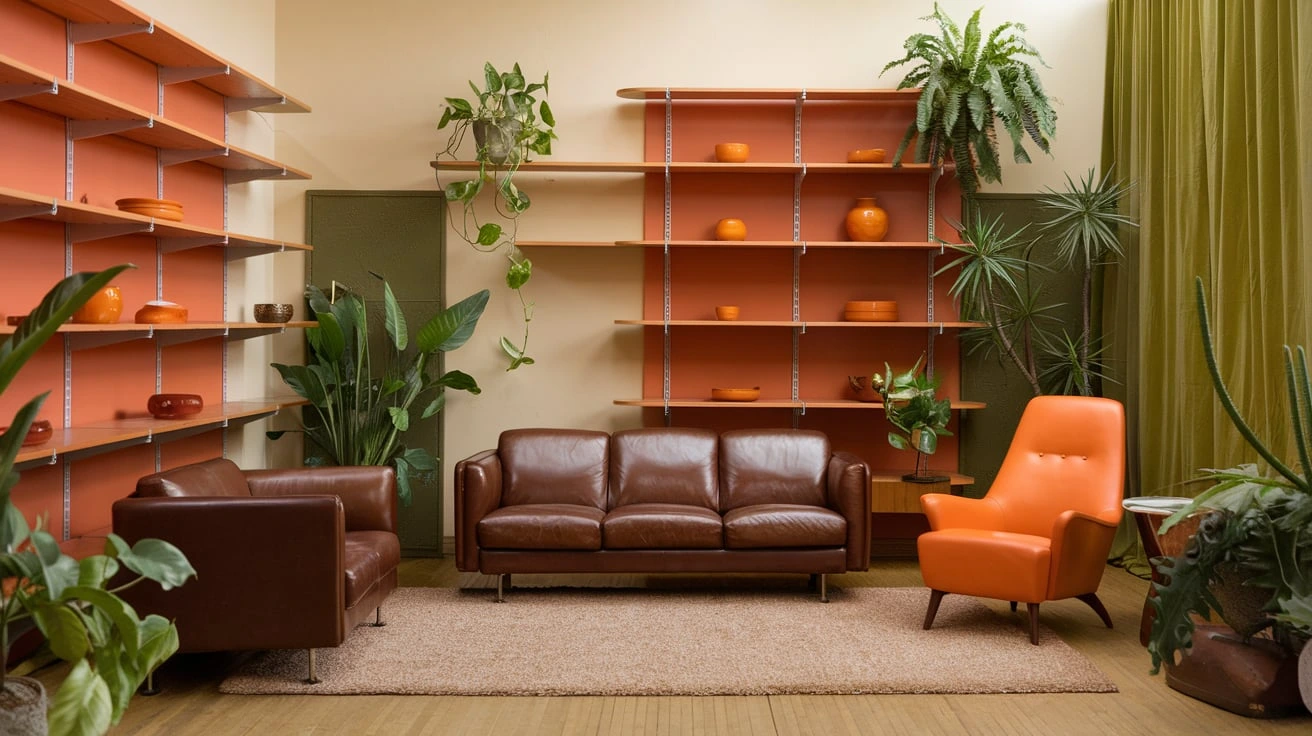
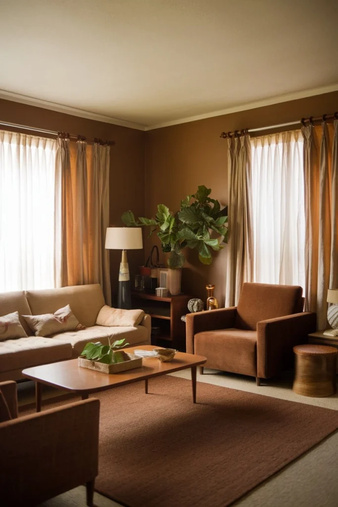
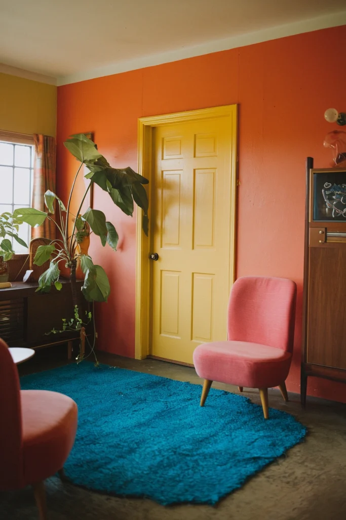
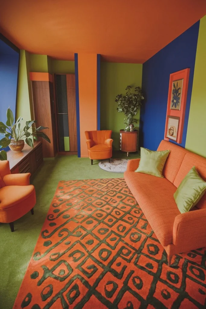
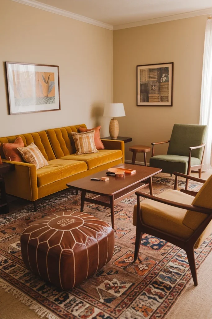
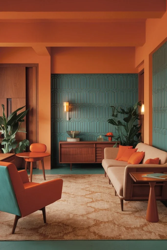
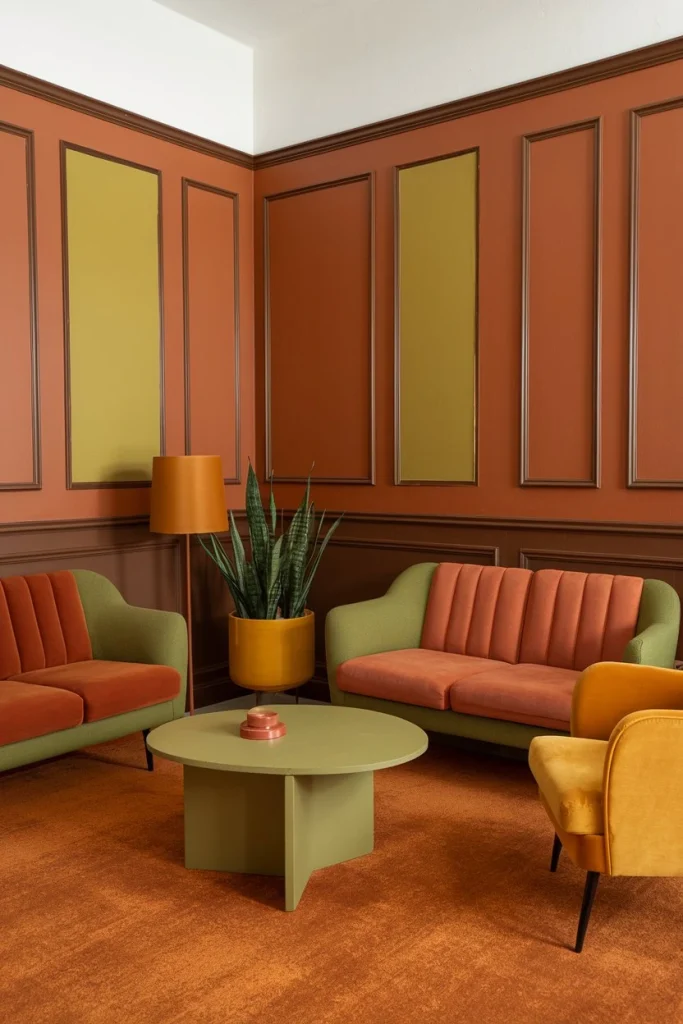
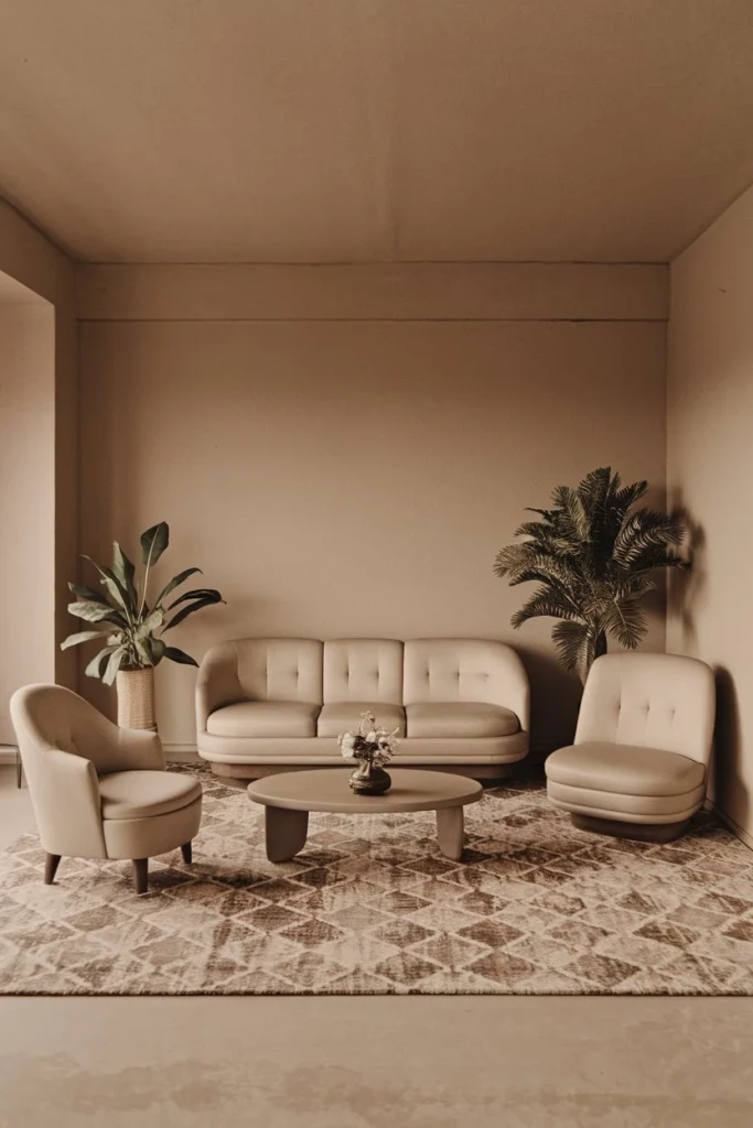
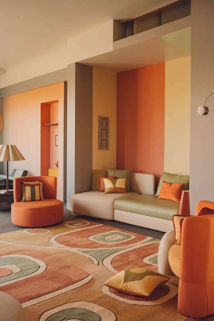
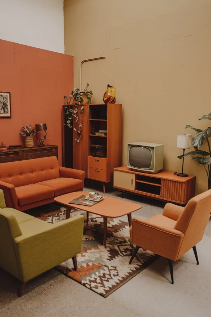
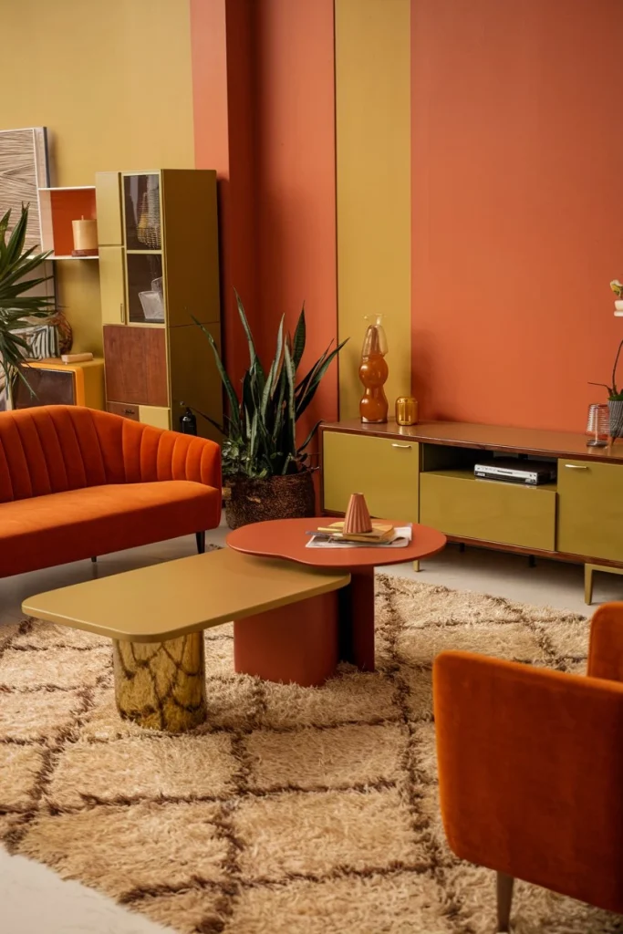
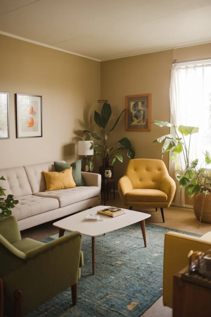
Are you ready to take a funky trip back in time? Let’s dive into the vibrant world of the 1970s color palette and discover how to bring that groovy vibe into your home!
The Foundations of the 1970s Color Palette
The 1970s color palette was a bold and exciting mix of colors that reflected the era’s free-spirited attitude. Here’s what made it so special:
Earth tones
Inspired by nature, these colors brought warmth and coziness to homes.
Bright hues
Vibrant colors that could light up any room and lift your mood.
Psychedelic combinations
Unexpected color pairings that created visual excitement.
For a different approach to earth tones, check out Scandinavian Interior Design, which also emphasizes natural hues.
Essential Colors of the 1970s Color Palette
If you’re looking to recreate the authentic 1970s color palette, these are the must-have hues:
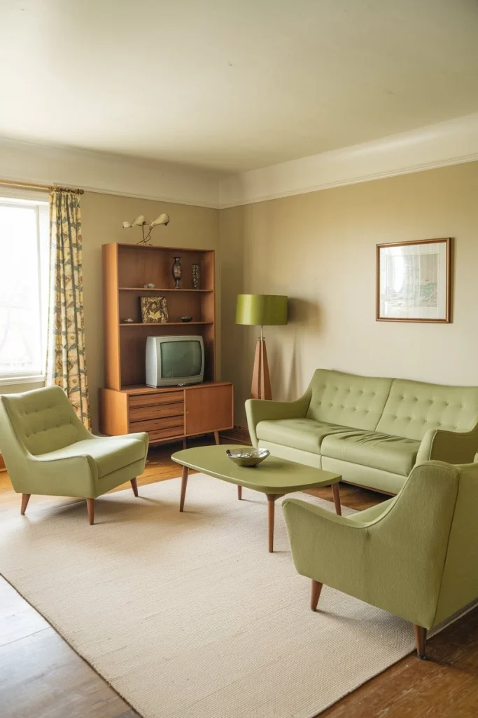
Avocado Green
This deep, rich green was everywhere in the 70s, from appliances to sofas.
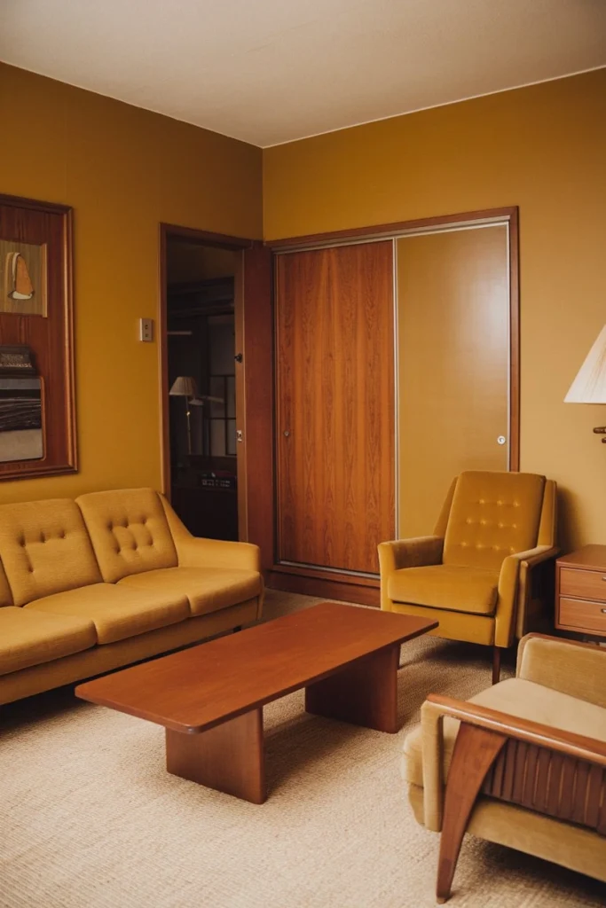
Harvest Gold
A warm, sunny yellow that brightened up kitchens and living rooms alike.
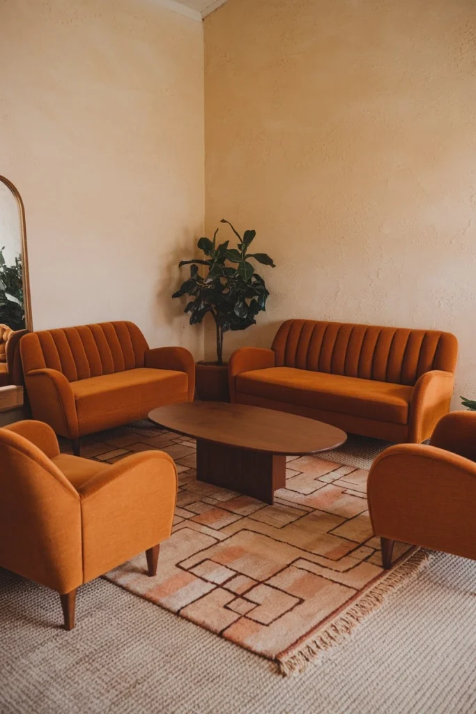
Burnt Orange
This deep, fiery orange added a punch of energy to any space.
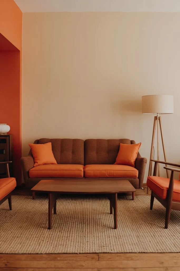
Chocolate Brown
A rich, earthy brown that grounded the bolder colors of the era.
Mustard Yellow
A zesty yellow that paired beautifully with other 70s favorites.
Creating a Balanced 1970s Color Scheme
Mixing colors from the 1970s color palette is an art form. Here are some techniques:
Complementary colors
Pairing opposites on the color wheel for maximum impact.
Triadic color schemes
Using three evenly spaced colors for a balanced, vibrant look.
Monochromatic looks
Exploring different shades of a single color for depth and interest.
1970s Color Applications Room by Room
Let’s take a tour of a typical 1970s home and see how they used the 1970s color palette:
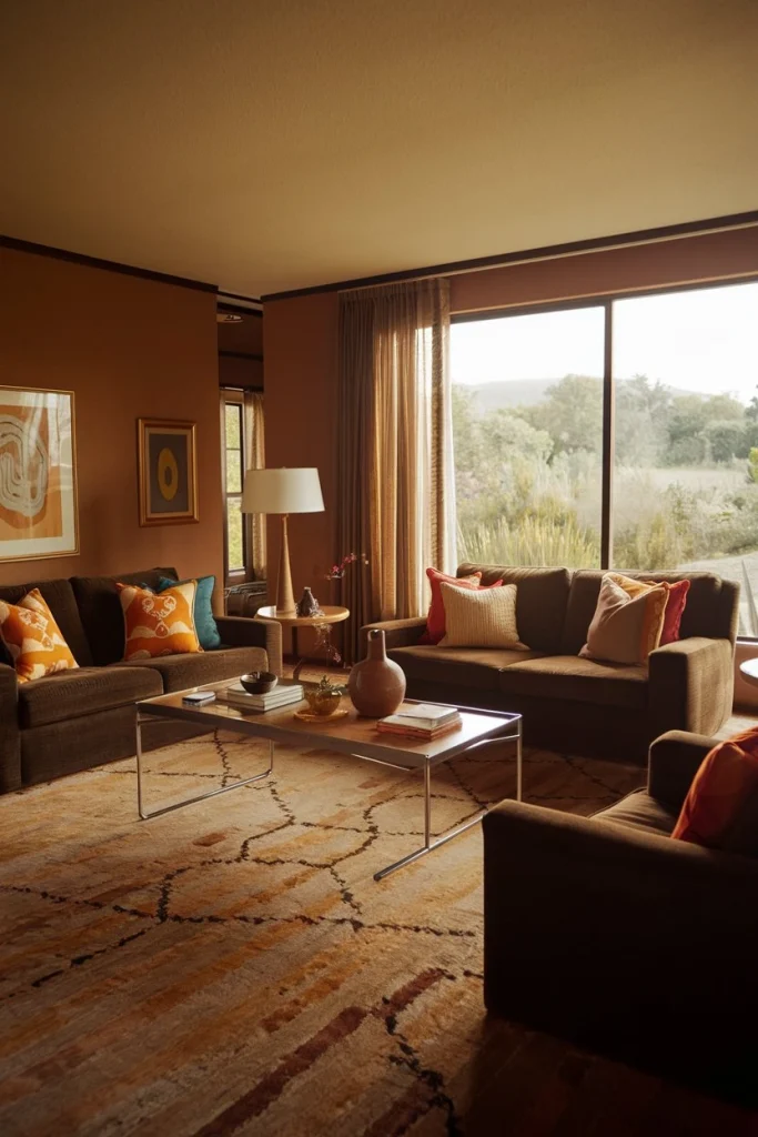
Living room
Earth tones dominated, with pops of brighter colors in accessories.
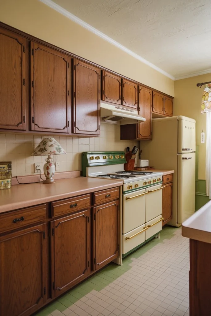
Kitchen
Bold colored appliances in avocado green or harvest gold were the norm.
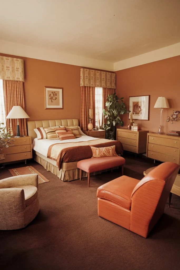
Bedroom
Warm, soothing colors created a cozy retreat.
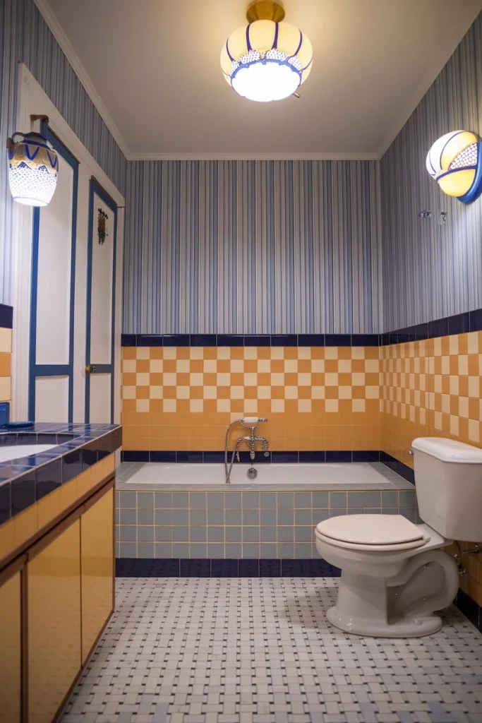
Bathroom
Colorful tiles and bold wallpapers made bathrooms anything but boring.
Modern Twists on the 1970s Color Palette
Updated Takes on Retro Hues
You can incorporate the 1970s color palette into a modern home:
- Use softer versions of classic 70s colors for a more subtle nod to the era.
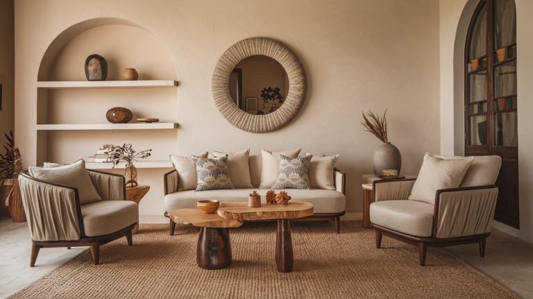
- Introduce 70s colors through accent pieces like pillows, artwork, or a statement chair.
- Blend 70s-inspired colors with contemporary neutrals for a fresh, updated look.
1970s Color Accessories and Decor
Bring the 1970s color palette to life with these decor elements:
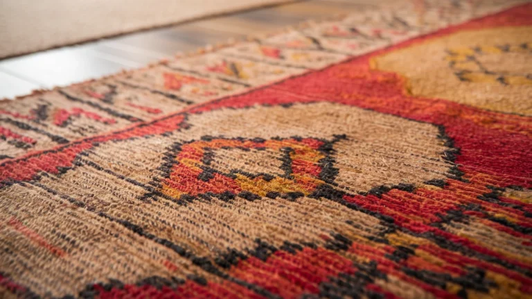
- Shag rugs in bold colors or patterns
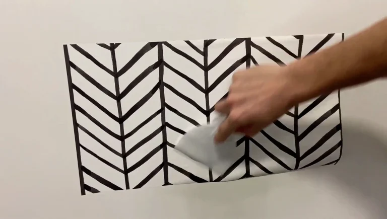
- Geometric wallpaper featuring classic 70s color combinations
- Retro-inspired furniture in vibrant hues
- Macramé plant hangers and woven wall hangings
- Lava lamps and colorful glassware
The Psychology Behind the 1970s Color Palette
Mood Enhancement and Nostalgia
The 1970s color palette wasn’t just about aesthetics; these colors can affect your mood:
- Bright colors like orange and yellow can boost energy and happiness.
- Earth tones create a sense of warmth and connection to nature.
- Bold color combinations can stimulate creativity and self-expression.
DIY Projects Inspired by the 1970s Color Palette
Bringing Retro Colors into Your Home
Try these fun projects to add a touch of 70s color to your space:
- Paint an accent wall in a bold 70s hue like burnt orange.
- Upcycle old furniture with harvest gold or avocado green paint.
- Create a colorful macramé wall hanging using 70s-inspired colors.
- Design a gallery wall with vintage posters featuring the 1970s color palette.
- Sew your own throw pillows using fabrics in classic 70s patterns and colors.
The Enduring Appeal of 1970s Colors
Why We Still Love Retro Hues
The 1970s color palette continues to captivate us today:
- It offers a sense of nostalgia and connection to the past.
- The bold, cheerful colors can lift our spirits and energize our homes.
- 70s colors provide a unique alternative to modern minimalist palettes.
- Mixing vintage and contemporary elements creates a personalized, eclectic style.
Incorporating 1970s Colors in Different Design Styles
From Boho to Mid-Century Modern
The versatile 1970s color palette can work with various design aesthetics:
- Bohemian: Embrace the full spectrum of 70s colors for a free-spirited vibe.
- Mid-Century Modern: Use 70s colors as accents in a sleek, minimalist setting.
- Eclectic: Mix and match 70s hues with other era-specific colors and patterns.
- Contemporary: Choose one or two 70s-inspired colors to add warmth to a modern space.
So there you have it, color lovers! You’re now equipped with all the knowledge you need to bring the groovy 1970s color palette into your home. Remember, the key to mastering 70s color schemes is to be bold, have fun, and let your personality shine through. Whether you go all out with a full-on retro makeover or just add a few nostalgic touches, your home will be far out and fantastically unique!
Don’t be afraid to experiment with these vintage color combinations. The 1970s were all about self-expression and breaking the rules. So go ahead, embrace the funky 70s aesthetics and create a space that’s as individual as you are. Your home will become a vibrant conversation starter, filled with the energetic spirit of the 1970s!

