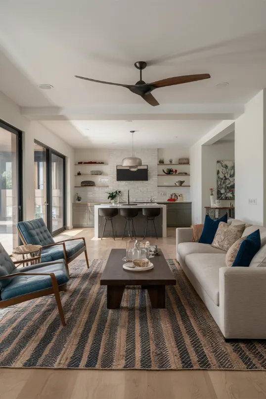
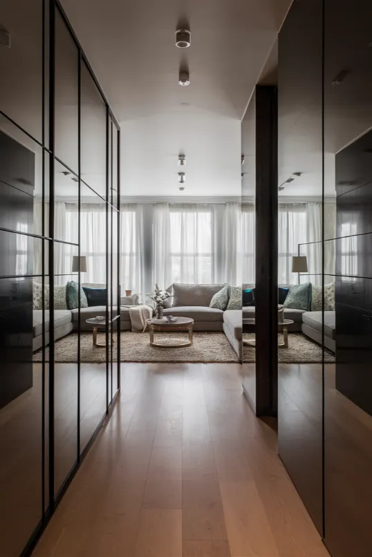
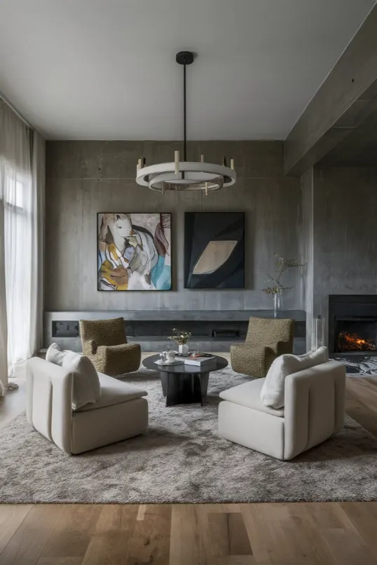
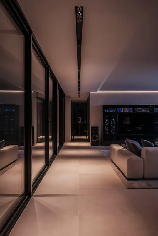
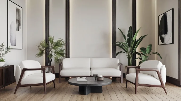
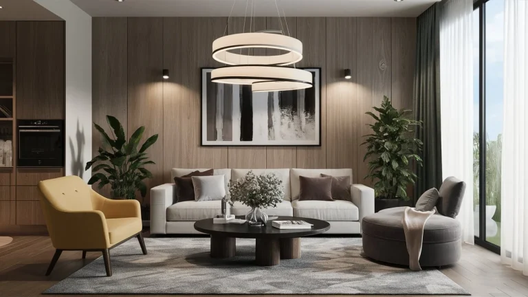
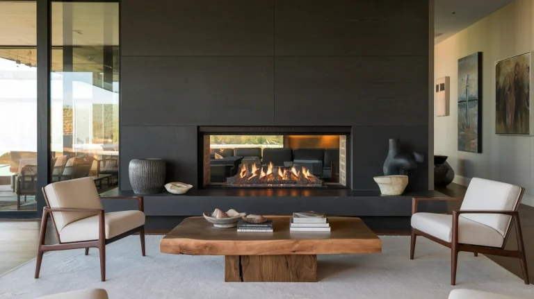
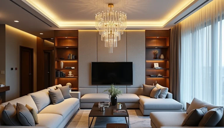
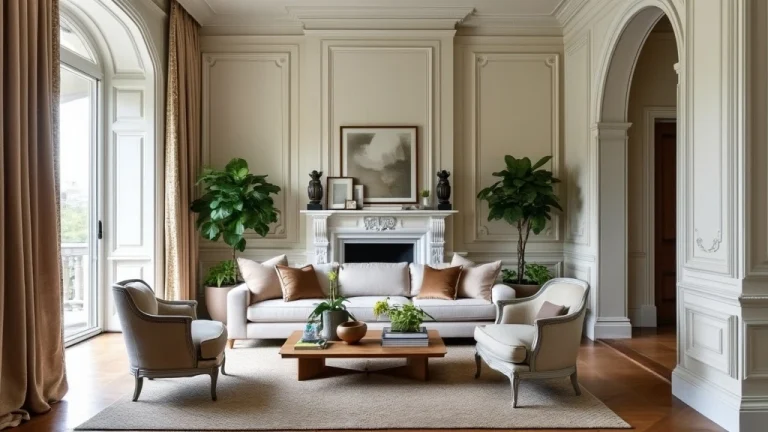
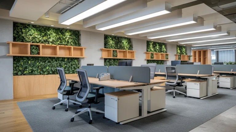
Ever walked into a room and felt like you’ve stepped into the future? That’s contemporary interior design for you. It’s all about the now, the fresh, the cutting-edge. But here’s the thing: nailing that sleek, modern look isn’t always easy.
So, I’m gonna break it down for you. No fluff, no BS. Just 19 solid ideas to bring your space into the 21st century. Let’s dive in.
What Makes Contemporary Interior Design Stand Out?
Before we jump into the ideas, let’s get real about what contemporary design actually is. It’s like the cool kid on the block – always changing, always evolving. It’s not stuck in the past like some other styles (looking at you, Victorian).
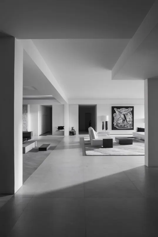
Contemporary design is all about clean lines, neutral colors, and minimalism. It loves natural light and puts a big emphasis on space and shape. It’s like your space took a deep breath and let out all the clutter.
Now, let’s get to the good stuff.
1. Go Monochrome
| Aspect | Details |
|---|---|
| Primary Colors | Shades of one color (e.g., gray) |
| Key Features | Contrast with different shades |
| Highlight | Add one bright accent piece |
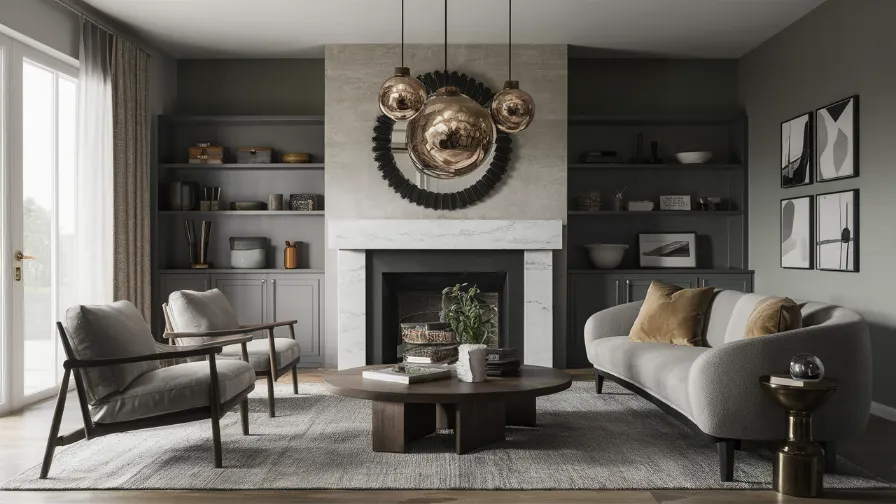
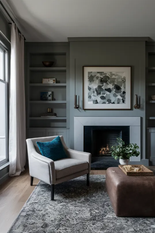
First up, let’s talk color – or lack thereof. Monochrome doesn’t mean boring. Pick a color, any color, and run with it. Use different shades throughout your room.
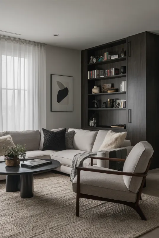
Try this: Start with a white base (walls, big furniture) and add in different shades of gray. Light gray curtains, dark gray accent chair, charcoal throw pillows. Boom. Instant contemporary vibe.
But here’s the kicker – throw in one piece that pops. Like a bright yellow lamp in your sea of grays. It’ll make the whole room sing.
2. Mix Textures Like a DJ Mixes Tracks
| Aspect | Details |
|---|---|
| Key Textures | Smooth, chunky, sleek, rough |
| Combination | Leather couch with chunky knit throw |
| Purpose | Create contrast and depth |
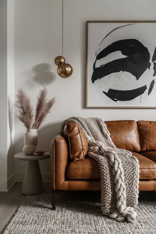
Contemporary design is all about the feels – literally. Mixing textures is key to keeping things interesting without cluttering up your space.
Here’s how to nail it: Pair your smooth leather couch with a chunky knit throw. Put that sleek glass coffee table on a shaggy rug. Hang some rough wooden shelves on your smooth painted wall.
The goal? When someone walks into your room, they should want to touch everything. It’s all about creating contrast and depth.
3. Let There Be Light
| Aspect | Details |
|---|---|
| Natural Light | Use sheer curtains or none |
| Artificial Light | Highlight with floor lamps |
| Special Feature | Smart glass for privacy |
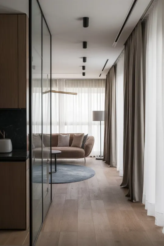
Natural light is your best friend in contemporary design. It makes your space feel bigger, brighter, and more alive. So, ditch those heavy curtains. Go for sheer or nothing at all.
If privacy’s an issue, try this cool trick: Use smart glass. It goes from clear to opaque with the flip of a switch. How’s that for living in the future?
And don’t forget about artificial lighting. Use it to create mood and highlight your favorite pieces. A well-placed floor lamp can turn a boring corner into a cozy reading nook.
4. Embrace the Void (AKA Negative Space)
| Aspect | Details |
|---|---|
| Concept | Use negative space |
| Strategy | Keep some walls and corners empty |
| Effect | Makes statement pieces pop |
Here’s a mind-bender for you: Sometimes, the most important part of a room is the empty space. In contemporary design, we call this negative space, and it’s your secret weapon.
Don’t feel the need to fill every corner. Let your rooms breathe. That empty wall? It’s not lonely, it’s making your statement piece pop. That bare corner? It’s creating flow, not waiting to be filled.
Think of it this way: You’re not designing with stuff, you’re designing with space. Mind. Blown.
5. Go Big with Art (Like, Really Big)
| Aspect | Details |
|---|---|
| Art Size | One large piece |
| Art Type | Abstract, photograph, etc. |
| Room Setup | Keep the rest of the room simple |
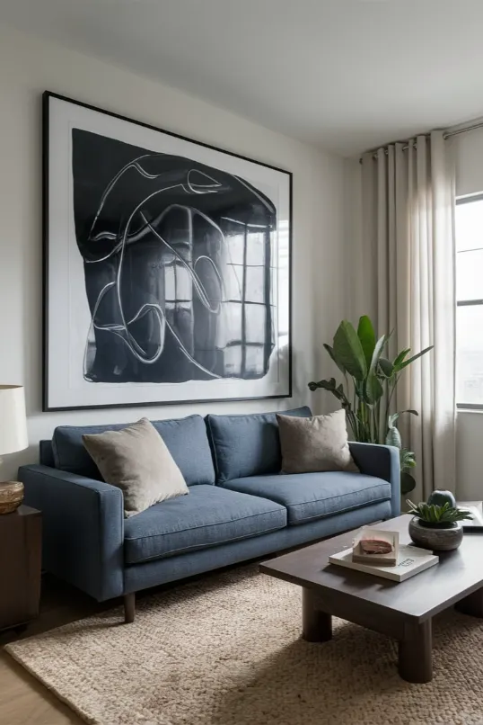
Forget about those little gallery walls. In contemporary design, bigger is better when it comes to art. One large piece can transform an entire room.
Try this: Get a canvas that’s almost as big as your wall. Abstract, photograph, whatever floats your boat. Hang it up. Stand back. Watch jaws drop.
But here’s the trick – keep the rest of the room simple. Let that art be the star of the show. It’s like the lead singer in a band, and everything else is the backup.
6. Play with Geometry (No Math Required)
| Aspect | Details |
|---|---|
| Shapes | Squares, circles, triangles |
| Usage | Mirrors, tables, vases |
| Goal | Create interest without chaos |
Shapes are your friends in contemporary design. Squares, circles, triangles – use them all. But don’t just stick them on the wall and call it a day. Get creative.
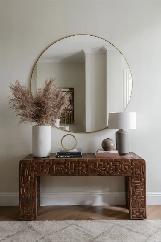
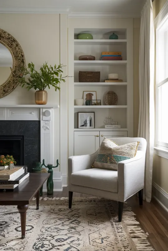
Try a round mirror above a square console table. Or a triangular coffee table in front of a rectangular couch. Mix and match shapes in your accessories too – think geometric vases or sculptural lamps.
The key is to create interest without creating chaos. It’s a fine line, but when you nail it, it’s magic.
7. Bring the Outdoors In
| Aspect | Details |
|---|---|
| Plants | Low-maintenance or faux |
| Placement | Corners, windowsills |
| Benefit | Adds life and color |
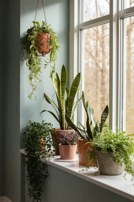
Plants aren’t just for bohemian spaces. They’re a secret weapon in contemporary design. They add life, color, and a touch of nature to your sleek space.
Don’t worry if you’re not exactly a plant whisperer. There are tons of low-maintenance options out there. Try a big fiddle leaf fig in the corner of your living room. Or a row of succulents on your windowsill.
And if you really can’t keep anything alive? Go faux. Today’s fake plants look so real, even Mother Nature might be fooled.
8. Keep It Neutral (But Not Boring)
| Aspect | Details |
|---|---|
| Colors | Whites, grays, blacks |
| Technique | Play with shades and textures |
| Purpose | Creates a clean, timeless base |
Contemporary design loves its neutrals. Whites, grays, blacks – these are your go-to colors. They create a clean, timeless base that’s easy to update when you want a change.
But neutral doesn’t mean blah. Play with different shades and tones. A charcoal gray couch on a light gray rug. Creamy white walls with bright white trim. It’s all about subtle contrast.
And remember, texture is your friend here too. A white linen sofa feels totally different from a white leather one.
9. Add Pops of Color
| Aspect | Details |
|---|---|
| Color Usage | Accent pieces like pillows or vases |
| Limit | 2-3 accent colors max |
| Effect | Adds interest to a neutral base |
Okay, so we’ve got our neutral base. Now let’s have some fun. Adding pops of color is like adding spice to a dish – a little goes a long way.
Try this: In your gray and white living room, add a bright blue armchair. Or some sunny yellow throw pillows. Maybe a red vase on your coffee table.
The key is to choose colors that complement each other and stick to 2-3 accent colors max. You want pops of color, not a color explosion.
10. Invest in Statement Lighting
| Aspect | Details |
|---|---|
| Lighting Types | Sculptural pendant lights, floor lamps |
| Feature | Use dimmers for mood setting |
| Placement | Over dining tables, kitchen islands |
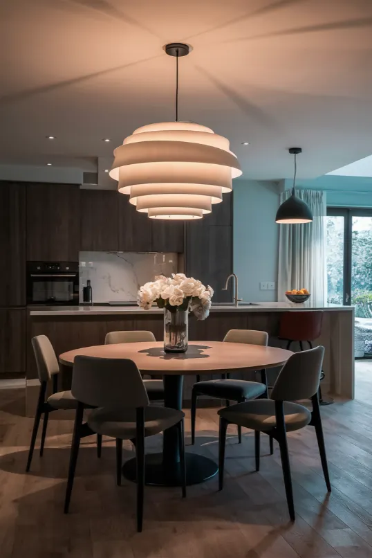
In contemporary design, lighting isn’t just functional – it’s a work of art. Forget boring overhead lights. Go for sculptural pendant lights or a sleek floor lamp that looks like it belongs in a modern art museum.
Try a big, bold chandelier over your dining table. Or a series of funky pendant lights over your kitchen island. Just make sure the scale is right – too small and it’ll look lost, too big and it’ll overwhelm the space.
And here’s a pro tip: Put your lights on dimmers. It lets you change the mood of your room with just a flick of a switch.
11. Keep It Sleek in the Kitchen
| Aspect | Details |
|---|---|
| Cabinets | Handleless, glossy finishes |
| Appliances | Integrated |
| Add Warmth | Wooden or copper accessories |
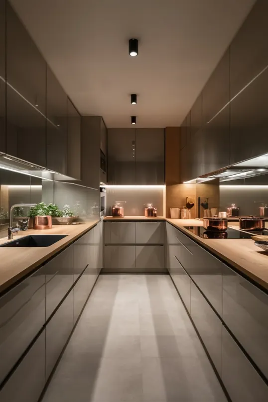
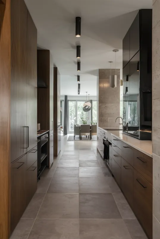
Contemporary kitchens are all about clean lines and hidden storage. Think handleless cabinets, integrated appliances, and sleek surfaces.
Try this: Go for flat-front cabinets in a glossy white or dark wood. Hide your fridge and dishwasher behind matching panels. Use a induction cooktop for a seamless look.
But don’t forget to add some warmth. A wooden cutting board or some copper pots can keep your kitchen from feeling too sterile.
12. Open Up Your Floor Plan
| Aspect | Details |
|---|---|
| Layout | Open floor plan, fewer walls |
| Definition | Use area rugs, furniture placement |
| Cohesion | Use color and decor |
Contemporary design loves an open floor plan. It creates flow, makes your space feel bigger, and lets you entertain like a boss.
If you can, knock down a wall or two. Turn your kitchen, dining, and living areas into one big, beautiful space. Use area rugs and furniture placement to define different zones.
Can’t knock down walls? No problem. Use color and decor to create a cohesive look throughout your home. It’ll feel open even if it isn’t.
13. Use Reflective Surfaces
| Aspect | Details |
|---|---|
| Mirrors | Opposite windows, in living areas |
| Other Surfaces | Glass, metals, high-gloss finishes |
| Effect | Makes spaces feel bigger and brighter |
Want to make your space feel bigger and brighter? Mirrors are your best friend. But don’t just stick to the bathroom. Use mirrors throughout your home.
Try a big mirror opposite a window to bounce light around the room. Or a mirrored coffee table to make your living room feel more spacious.
And don’t forget about other reflective surfaces. Glass, metals, high-gloss finishes – they all help bounce light and create a sense of space.
14. Go for Unconventional Furniture
| Aspect | Details |
|---|---|
| Pieces | Unique, statement furniture |
| Materials | Mix materials like wood and acrylic |
| Consistency | Maintain some uniformity |
Forget the matchy-matchy furniture sets. Contemporary design is all about unique pieces that make a statement.
Try an asymmetrical sofa or a coffee table that looks more like a sculpture. Mix materials too – a wooden dining table with acrylic chairs, or a velvet couch with a glass side table.
Just remember to keep some consistency. Too many statement pieces and your room will look like a furniture showroom.
15. Embrace Technology
| Aspect | Details |
|---|---|
| Features | Smart home technology |
| Integration | Hidden speakers, automated blinds |
| Benefit | Convenience and sleek design |
Smart home features aren’t just convenient – they’re a key part of contemporary design. But the key is to integrate them seamlessly.
Hidden speakers, automated blinds, a TV that looks like art when it’s not in use – these are all great ways to bring your home into the 21st century without cluttering up your sleek design.
16. Play with Levels
| Aspect | Details |
|---|---|
| Heights | Different levels for interest |
| Examples | Sunken living rooms, raised dining areas |
| Furniture | Low-profile sofas, platform beds |
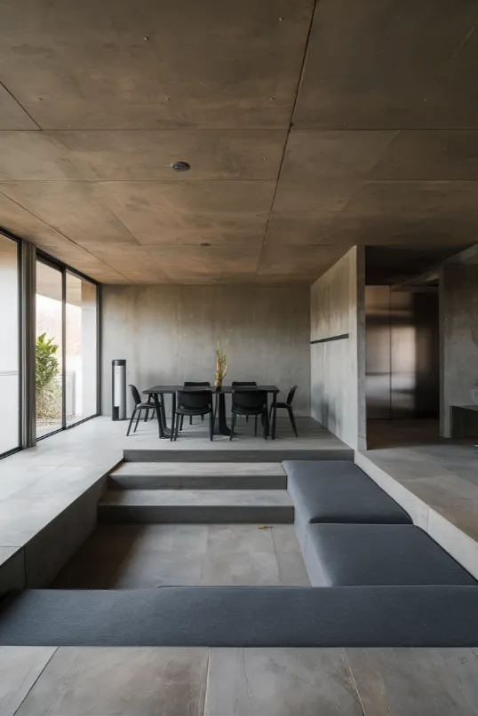
Who says your floor has to be all one level? Playing with different heights can add major interest to your space.
If you’re renovating, consider a sunken living room or a raised dining area. If not, you can still create levels with furniture. A low-profile sofa with a tall floor lamp. A platform bed. A loft workspace.
It’s all about creating visual interest and defining spaces without walls.
17. Focus on Flooring (It’s the Foundation of Your Design)
| Aspect | Details |
|---|---|
| Materials | Large tiles, wide-plank hardwood, concrete |
| Consistency | Same flooring throughout |
| Luxury Touch | Heated flooring |
Don’t neglect what’s under your feet. Your floor is a huge design element, so make it count.
In contemporary design, we love large format tiles, wide-plank hardwood, or even polished concrete. Whatever you choose, keep it consistent throughout your space to create flow.
And here’s a luxe touch: Consider heated flooring in your bathroom or kitchen. Your feet will thank you on cold mornings.
18. Don’t Forget the Ceiling
| Aspect | Details |
|---|---|
| Design | Painted same color as walls |
| Bold Choices | Dark ceilings, architectural features |
| Balance | Keep room simple if ceiling is bold |
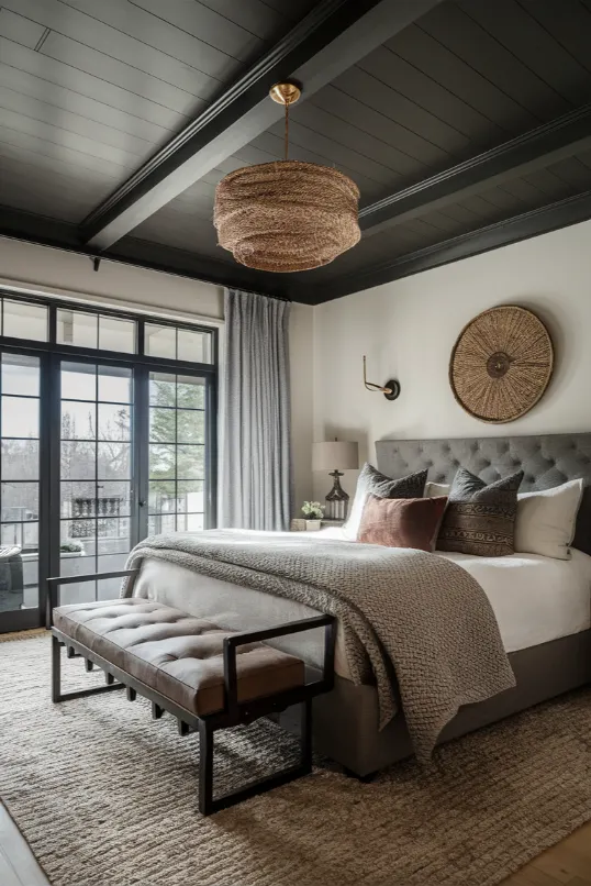
Look up! Your ceiling is prime real estate for design. In contemporary spaces, we often paint it the same color as the walls to create a seamless look.
But don’t be afraid to go bold. A dark ceiling can make a room feel cozy and intimate. Or try adding some architectural interest with beams or molding.
Just remember – if you go bold on the ceiling, keep the rest of the room simple. It’s all about balance.
19. Keep It Clutter-Free (Less Is More)
| Aspect | Details |
|---|---|
| Strategy | Declutter regularly |
| Storage | Smart storage solutions |
| Principle | Functionality and beauty |
Last but definitely not least – keep it clean, people. Contemporary design is all about simplicity and open space. So, declutter like your design life depends on it (because it does).
Invest in smart storage solutions. Keep surfaces clear. Follow the “one in, one out” rule – for every new item you bring in, one has to go.
Remember, in contemporary design, every piece should earn its place. If it’s not functional or beautiful (preferably both), it’s gotta go.
Conclusion
There you have it. 19 ways to bring contemporary interior design into your space. Remember, it’s all about what feels right to you. Don’t be afraid to experiment and make it your own.
After all, that’s what contemporary design is all about – breaking the rules and creating something fresh. So go ahead, give your space that modern edge.
And if you’re curious about different interior design styles, dive deeper into each one. You might find inspiration in unexpected places.
Now get out there and design like it’s 2024. Because in contemporary design, the future is now.

